THEMES: Analytics, concept development, interactive games
DURATION: 5 months
PLATFORM: Desktop game
ROLE: Product Owner & UX Designer
QUICK LINKS: Research | Journey | Game design | Demo
RESOLVING PLAYER DROP OFF THROUGH A UX LED PROCESS
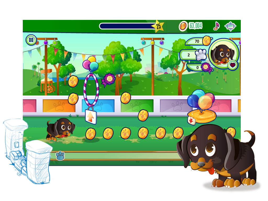
* sensitive information has been removed or obscured to preserve confidentiality
A BIT LIKE THE SIMS, FOR KIDS
Disney Superbia launched in 2012 to became one of the most successful online social games for Disney EMEA and quickly acquired a loyal fan base.
It provides an immersive experience to players within a Disney Channel branded world where they engage in quests, create an avatar and are able to buy items and outfits, all recognisable from their favourite characters and shows
THE CHALLENGE
Despite a dedicated audience, Superbia experienced a high player drop off during the first 10 levels.
After analysing the data we noticed a correlation between game abandonment in the first 10 levels and the amount of money players were able to make. Superbia players rely on the in-game currency, gold, to buy items by completing quests and making ice-cream – pretty tough, repetitve work.
Clearly it was taking too long for new players to accumulate gold. While adjusting the amount of money players could earn may have been an obvious solution it would have further complicated the balance of the game economy overall. We needed to find an alternative solution so we invited girls aged 6-12, the core audience, to a testing session to get more in-depth feedback about where to focus our efforts.
The session was run in friendship pairs with a mix of existing and new players, all of whom watched the Disney Channel.
PETS ARE AT THE CENTRE OF A CLEAR PATTERN OF GAMEPLAY

IDENTIFYING AN OPPORTUNITY
Drawing on the feedback from research and analysis I developed requirements for a new activity involving pets earning gold that was different from the exisiting pets loop;
- Fun and fulfilling to play on a daily or regular basis
- Quick and self contained
- Not prohibitive to play – ie. dependent on experience level
- Reward a fair balance of gold
- Feel fresh and different from other aspects of the game
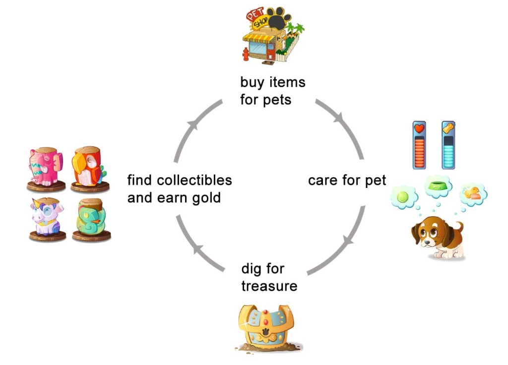
THE EXISITING PETS LOOP
We decided that an arcade style mini game within Superbia was the most suited game mechanic to fulfill our requirements. It would ensure that the game felt fresh and fun to play every day and a pets obstacle race felt like a good candidate for this style of game.
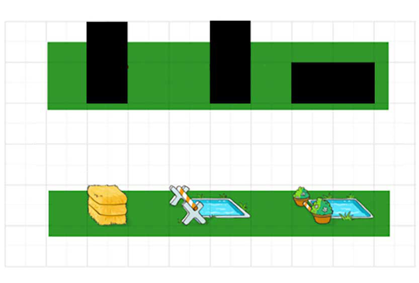
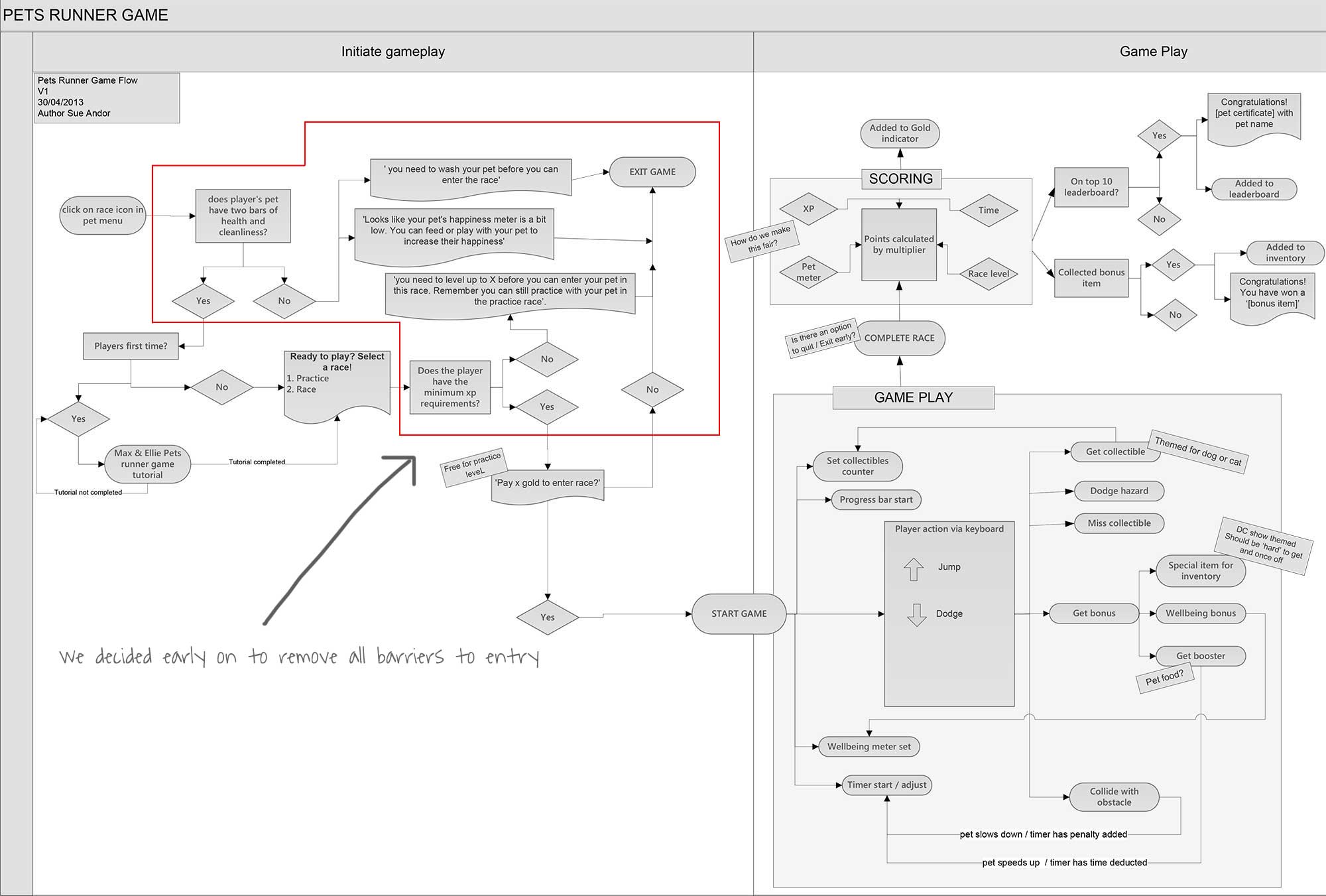
My first steps in evolving the game design were to outline a list of feature requirements and then map the game flow, addressing aspects such as showing tutorials to first time players but not to established players, and how the scoring and game mechanics would work.
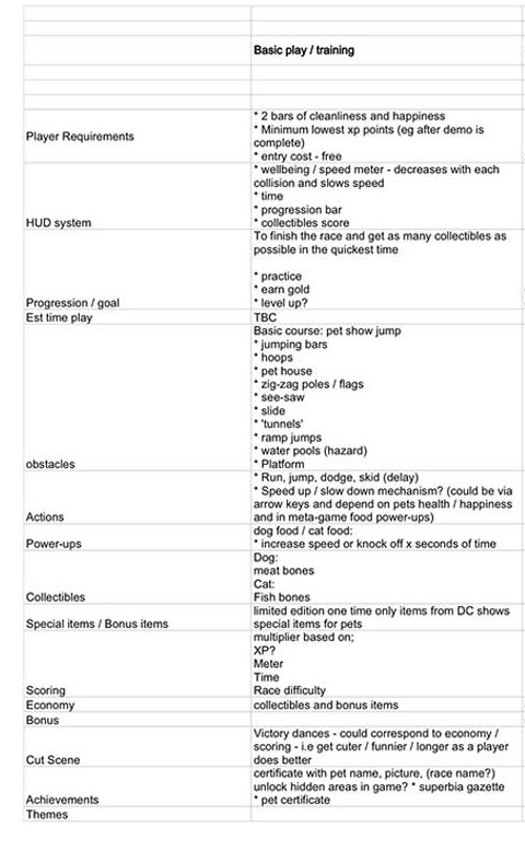
Look and feel
Game play
Interaction feedback
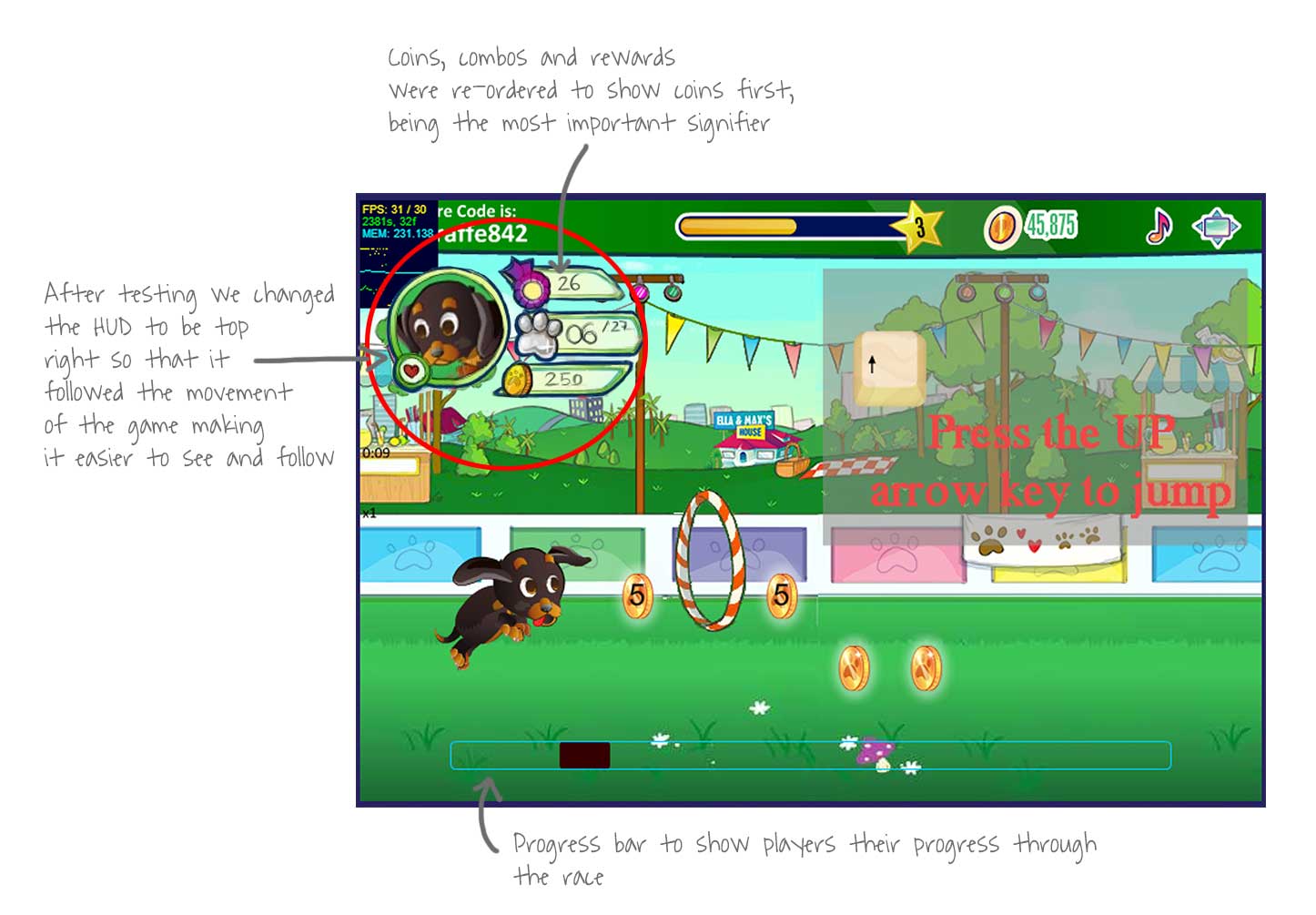
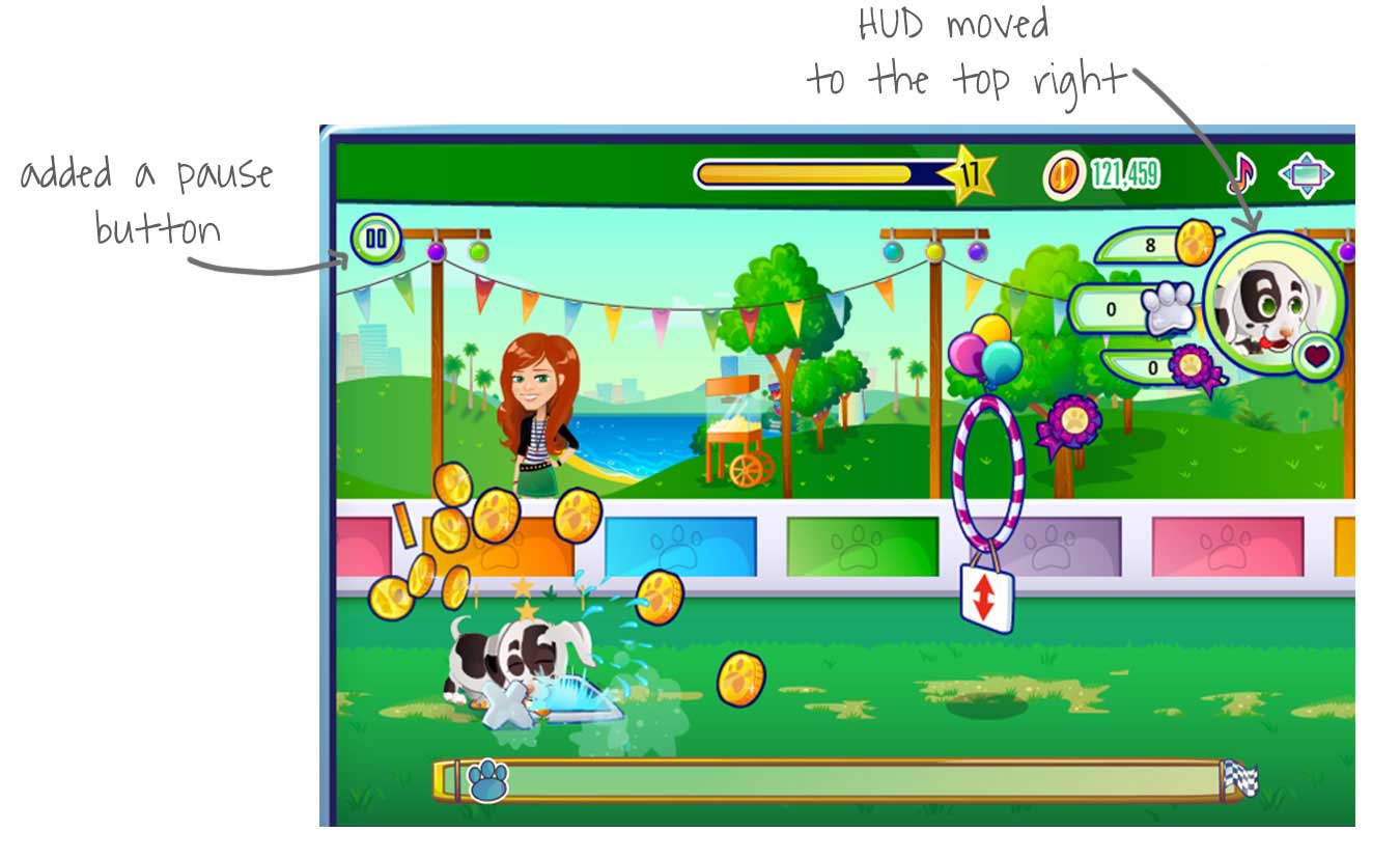
The User Interface / Heads Up Display
LOOK AND FEEL
I always place a lot of emphasis on visual design – ensuring that elements achieve the right level of cohesion. This was especially important in a game like Superbia where visual design is an important part of the player’s experience and perception of the game.


The start screen design is an example of a differnt visual challenge we encountered. The original was off brand with hard to read text and no clear CTA heirachy – racing is the primary CTA that players will interact with most often, with practicing and the tutorial being supporting, secondary CTAs.
The second version was better but still had too many conflicting elements.
The final version with cohesive elements, a clearer visual heirachy and easier to read text.
GAME PLAY
One of the most challenging aspects of designing a game is getting the game play mechanics to feel right.
This is a mixture of physics, such as finding the right pacing and speed and ensuring that key presses and resulting jump lag time allows for smooth feeling obstacle clearance, while also effectively communicating visual signifiers that can be interpreted by players as objects are approaching at speed.
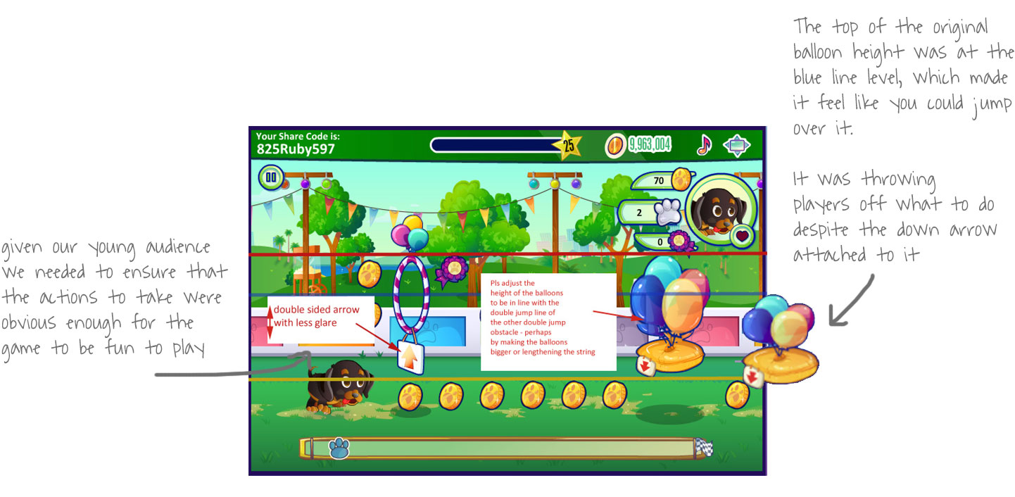
INTERACTION FEEDBACK
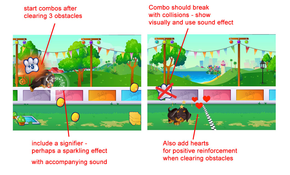
During our first few rounds of testing the game felt really flat so I mocked-up some ideas for us to try in another iteration of the game. One of the elements we introduced was a combo feature where players would go into combo mode for clearing consecutive obstacles. The combo mode added a dimension of fun, challenge and reward to the game which helped to lift it from feeling flat.
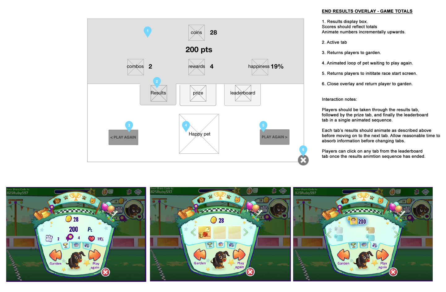
I wanted the results to feel rewarding and make it obvious for players to see what they had won. I also wanted it to be easy for them to take next step actions. There was a lot of information to show so we needed to figure out how to do it simply. Wireframes were a helpful tool for me to communicate the initial design to our development partners.
OUTCOME
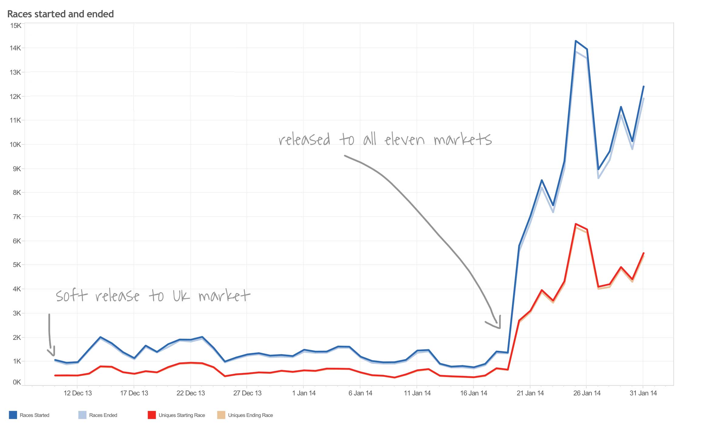
There was a good uptake of game play across all 11 markets. Results indicated that not only were players returning to play the race several times each day but that also very few races were not being finished – a very good result.
DID IT IMPROVE THE IN-GAME ECONOMY?
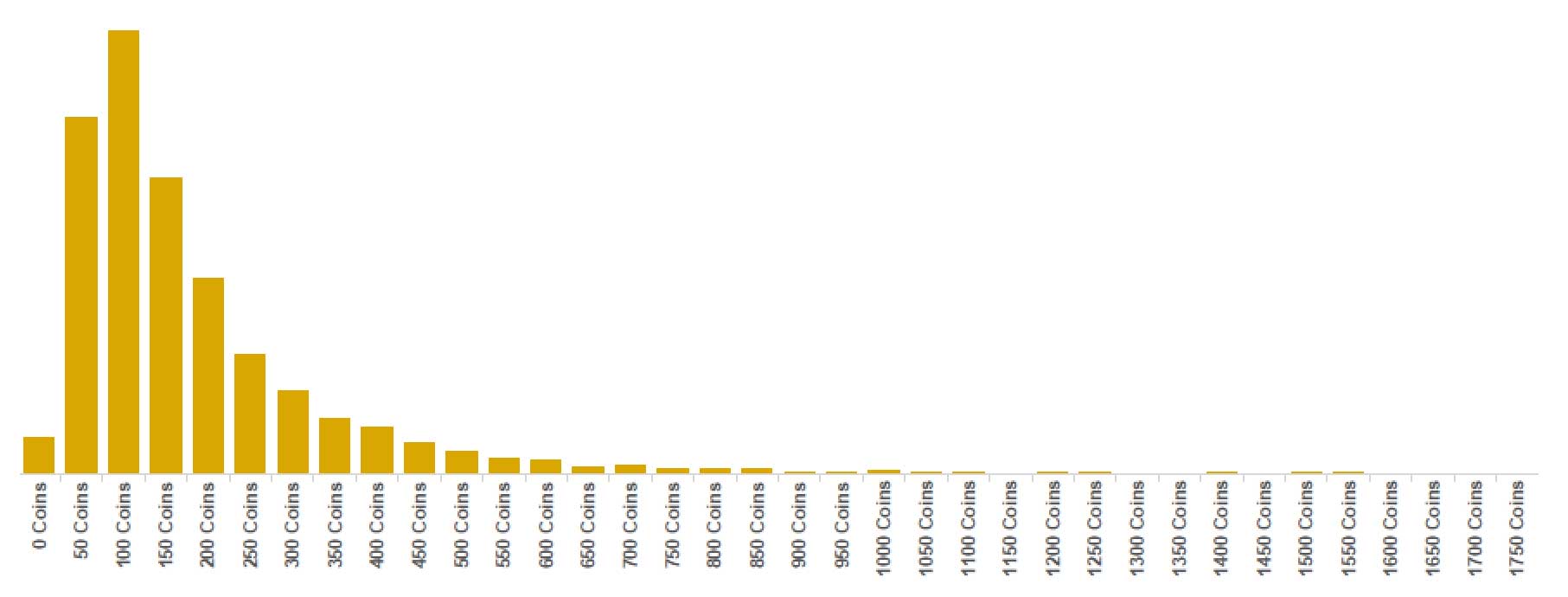
Most players were earning money each day playing the game and some were able to make significant amounts. This, combined with the high engagement factor the races were providing had a significant impact on player drop off levels which more than halved in the months following the releases.
*After several successful years, Superbia was retired in 2016.

